Composition
Created | Updated Jun 22, 2003
A copy of a posting made to Werekitty by Amy 
Ok. A few thoughts on composition. It's a personal view, obviously but I hope it's helpful.
Shapes and Colours
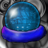
In representational illustration like this it is very easy to get hung up on the objects we're drawing. But to make a good picture the shapes and colours must work together in their own right to make an attractive pattern. I find it useful to force myself to forget about the objects from time to time and to sit back from the monitor and look at my composition as a pattern. There are rules that can be applied but in fact most of the time you can rely on instinct, thank the deity of your choice and then analyse it for future reference. An example of a composition that works by virtue of its shapes is DoctorMO's B2496631. Note the energy of the repeated circular shapes. One that works mostly because of the colour is Peet's B2679757. If you ignore the content of the picture you'll see that it is a colour wheel. It draws you into the picture and makes your eyes explore the content.
By working on separate layers you can play with the composition more easily.
Extending the Canvas
You've already noticed that the final graphics are relatively small. The way round this is to use the space you're NOT given. Let me explain.
Firstly, you can use the space outside the canvas by tapping into people's imaginations. People are very clever, they can extrapolate a picture from a very small extract. Go to google and type in 'brownies'. You'll see a while lot of brownie photos but the good ones are those which just show a corner of a stack of yummy brownies, plus a few crumbs, and leave the rest to your imagination. The good photographers miss out more than they photograph. Let the elements in your picture spill over the edges. If you try not to let the things touch the sides you end up with a picture that looks as if it isn't giving value for money in some sense.
Secondly, use depth. You may be restricted to 200 pixels on the x-axis and 160 on the y-axis but no one is telling you what to do on the z-axis. To use the z-axis you can use the tricks of perspective drawing and you can also use colour. Blues tend to recede, reds advance. Cooler colours will look further away than warmer colours. Look at my mouse banner for an example. 500 wide, 100 high and several zillion deep.

Putting it together
Putting all these ideas together, I particularly liked the photo of brownies on a yellow plate and I took the elements of your brownie picture, duplicated them, rotated them, shifted 'em about and came up with a new brownie picture. I'm not saying it is the best that can be done, or that this is exactly what you should do, but it serves to illustrate the point. There is an interesting negative shape in the middle - brownies are boring squares but you can make new fascinating shapes by putting squares together. The oval 'plate' provides an interesting curved line. The brownies are resting *on* something rather than floating in space. The brownies continue outside the rectangle, giving the illusion of more space, and the blue tablecloth recedes giving an illusion of depth which is further enhanced by the use of drop shadows (although I'm not keen on those generally).
I also added a lighting effect, using a tangerine-coloured light to add a bit of drama and excitement. I did all of this in Corel Painter.